Thoughts on plaster prints
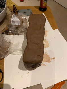
I recently went to the Anthony Gormely exhibition and was interested in the plaster and clay work, I purchased a supply of clay at the exhibition which I thought would be useful for the ‘Undeveloped Film’ piece I would be making but I knew from experience that clay would not be well suited to printing on. In continuing the set of living monuments to father, I came upon used plaster casts in the studio and thought of using this a means to print on after experimenting with liquid emulsion in the darkroom with a variety of materials.
It seemed appropriate considering my Fathers former art work with a variety of materials including clay and plaster. The left over plaster used in the studio is oftern poured into rectangular tubs which produce a deep shape that tapers down to the base when you invert it. In creating this living monument to him I wanted to capture a double exposure with his face and the also the face of his grandfather clock that I have used the first monuments that I produced during the Positions and Practices Module. In this instance I was again referring symbolically to the last moment before my fathers paralysis where he wound his clock. That moment forever frozen as he is trapped in body that no longer has the mobility it once had. The plaster shaped and colour was also reminiscent of a tomb which I felt resonated with this idea of the monument. It reminded me of Cristobal graveyard in Havana, which I visited and photographed back in 2000.

Chris Matthews (2000)

Taken at the Anthony Gormely Exhibition a the royal academy London

I captured several portraits of my father sat in his armchair almost like a throne and made use of natural light creeping in through the window. I then captured several frames of the face of the grandfather clock. This clock is significant in that before my father had his stroke the last thing he did before his paralysis was to wind the clock, ‘buying himself a few more hours’ as he put it. I have used the clock in previous monuments in this series. For the plaster prints I wanted print a composite image onto the surface. Several trial runs were unsuccessful due to the properties of the plaster. Sanding the surface of the plaster seems to give the emulsion something to bond to, adding additional coats also improved the result. Unfortunately the prints have a limited lifespan and fade overtime. I’m assuming that the emulsion may be sinking into the plaster. I coated the most recent print with 2 coats of clear varnish which seemed to prolong its life. This allowed me to photograph the plaster for possible use as final outcome. The porous nature of it presented several problems, for instance air rises up and causes bubbles under the emulsion, I was able to remove the air with careful pinpricks, but there was still significant damage. From discussions with those who are more experienced with the properties of plaster, I was advised that I should try coating the plaster with varnish, perhaps drying the plaster in an oven. Other suggestions were that I could use PVA glue to create a film that would allow me to peel the print off. Initially I didn’t feel this would be beneficial, but it sparked a memory of shrouds, so this is something I may explore in later versions. The fact the images deteriorate interests me from a symbolic standpoint considering the themes such as death, mortality, illness, the passing of time that are associated with the work so I may try and incorporate the fading examples in some way.


Cmatthews taken feb 2020, was playing with a few ideas of using digital and then putting on acetates for the portrait but opted for film in the end as this will work better with an enlarger


Before I attempted a print on plaster I produced some test prints of the composite on paper, just to get an ideas of exposure times, sizing etc.

This is the view under the enlarger as I printed the composition image, I had to use a dummy plaster to set up the focus for each negative as it was difficult to focus with the red light. I also had to make adjustments to the size of the image for both negative to achieve the composition that I wanted. I printed the grandfather clock first for 8 seconds on F2.8 and then the portrait for roughly 20 seconds 2.8 with some dodging on the right hand side of the face to allow more detail in the highlights in the hairline.
Winding the grandfather clock before he went to bed before he had a stroke was the last thing he did. He suggested he 'was buying himself more time'

One of the first attempts, was largely unsuccessful. You can barely make out any parts of the image. I put this down to needing multiple coats of emulsion and also not fixing long enough. In later versions I soaked it in fixer for over 30mins to give it a better chance of survival.

On the 3rd attempt the results were far more successful. It still had a limited lifespan but took several days to fade rather than several hours

Removing air from the bubbles in the emulsion with a pin.

3 days after the print was created, it has faded considerably but some elements of the portrait image remains.

Lining up the original and the 3 weeks old version, used grids in photoshop to line up. Like this idea of Duality, Barthes mentions this in Mythologies, life and death, think this could work well


Once the I had moulded the brick shape, I air dried it for a about 3 weeks and then took photographs of it in the studio. The Photographs were taken in the studio with a two point lighting flash set up, both lights with soft boxes. I shot the images with a 60mm 2.8 Nikkor lens which is a very sharp prime lens suitable for close ups. The images require further context to understand the intended meaning. In this respected they would need some element of explanation were they to be presented in an exhibition. from my own personal perspective of being link to Pink Floyd’s the Wall, this being another brick in the wall around the pain I have locked away.


I've long been familiar with fight posters that are produced to the sell the fights to the public. This has been a popular method of advertising boxing matches for it's entire history including early matches in the 19th Century such as John L Sullivan vs Gentleman Jim Corbett. In response to these I am intend to produce some poster style images that will engage with the questioning of masculinity. This idea has also been influenced by Barbara Krugers, Gillian Wearing and finally from some of the drawings in Grayson Perry's book the Decent of Man.


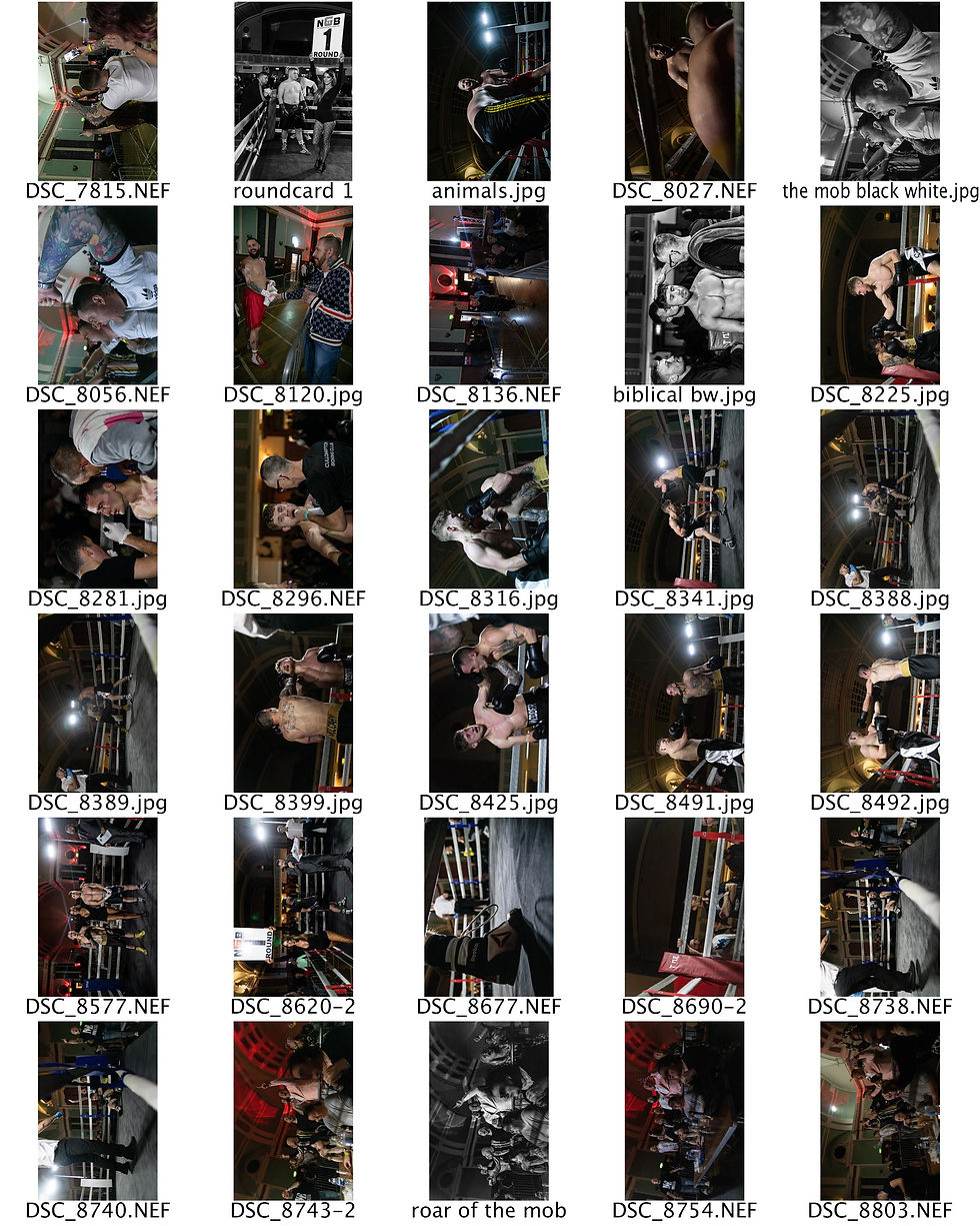
I don't produce contact sheets when I cover boxing shows, there are just too many images capture to make them useful so the one included here is just an example. I shot roughly 5000 shots at this show so the best way to work through and select is used the catalogue in Lightroom and export selections to photoshop to edit. It's a long process because there are so many images but this workflow I have found to be the quickest most effective method for me.
In terms of edits, I edit in raw, usually boosting the clarity and balancing shadows and highlight to my needs. I usually work in black and white, aesthetically I feel it just works with boxing and also give the difficult light, the noise does not have the same gritty feel in colour. Newton Rings/Aliasing can be an issue with my D850, not having an antialiasing filter means the images are sharper but can result in the characteristic 'wavey lines' Only really an issue with iso's over 3200 and when you push the exposure by roughly 2 stops.
Reviewing and edit these shots takes weeks, not the best show I have covered in terms of drama but happy with the results overall.
35mm from the boxing show, ilford 3200 on Leica M6 50mm f2

Nothing really jumped out from the film I shot, quick like the ones of the bell but not sure I use any of these in the final set. Some might be useful for the posters. The light was poor so even with 3200 iso it was not easy.


Looked up fonts to match the Caesars
Palace font.


Reviewing the a finished version in comparison to the source material, I could see the hue wasn't quite right. The original had more of an orange tint to the backdrop colour so I added an orange filter to match this more closely. Below is the completed version used for submission.


Relevant Images taken during the lockdown
One set of images that came from thoughts about abandonment were the 3 images included below that I feel may yet have a place in my WIP. It was someone unexpected but I came across or at least was drawn to these things I would find when taking my daily walk in the local area. The symbolic aspects of them resonated with my feelings of abandonment regarding my father. His alcoholism let to that abandonment in terms of our relationship for many years so the toy, the bottle and the two posts had meaning for me. We both had a love of Oscar Wilde’s short stories such as the Happy Prince and the idea that inanimate objects could have personalities as is often the case in Wilde’s stories triggers narratives when I see these images. Also looking at William Eggleston and Stephen Shores work as they often captured things left behind, I like the collar they capture, it has a filmic/movie feel to it.


I discovered a piece of online called Artsteps which you can use to set up a 3 dimensional exhibition space where you can display still imagery as you would in a real exhibition. It was useful in considering the sequencing aspects of the work. A short video clip of the 3d gallery I produced is below. Unfortunately it is not a particularly stable software so whilst useful for planning exhibitions I would explore using other software in future.
Note about Corona Impact
Jesse suggested we should write a note on the impact to the assignment from the lockdown. Not entirely sure the best spot for this but, project development seemed as good a place as any. I was fortunate to get the boxing shoot completed just before the lockdown. Without that it would have been difficult to submit a significant WIP folio so I am thankful for that. I intended to shoot more boxing and possibly wrestling shows, but that became impossible after the lockdown. I would have probably produced further plaster cast prints to fine turn the monument outcome. This was trickier to attempt at home and not in a proper darkroom. I'm lucky I have a changing bag and a decent scanner so could still shoot and develop film One benefit was I was able to sit in on a few more webinars and have tutorials in the day as I have been working online line. Overall, some impact but could have been worse. Happy with the WIP. Would have like to have produced more posters if I'd been able to shoot more broadly.

Another poster that I started but didn't get to capture a suitable image after lockdown
